UI evolution
August 20, 2023A few days ago I stumbled upon this toot about a web site
[…] showcasing websites from the 1990s through the mid-2000s: Web Design Museum
This triggered the thougth that also Clipperz has been running since 2007, and went through a few major versions of its UI that tried to match the expectations of web users across more than 10 years.
~2006 /alpha
Internal prototype, never publicly released; it was mostly a proof of concept that our crazy idea to handle passwords securely in the browser was actually feasible.
~2007 /beta
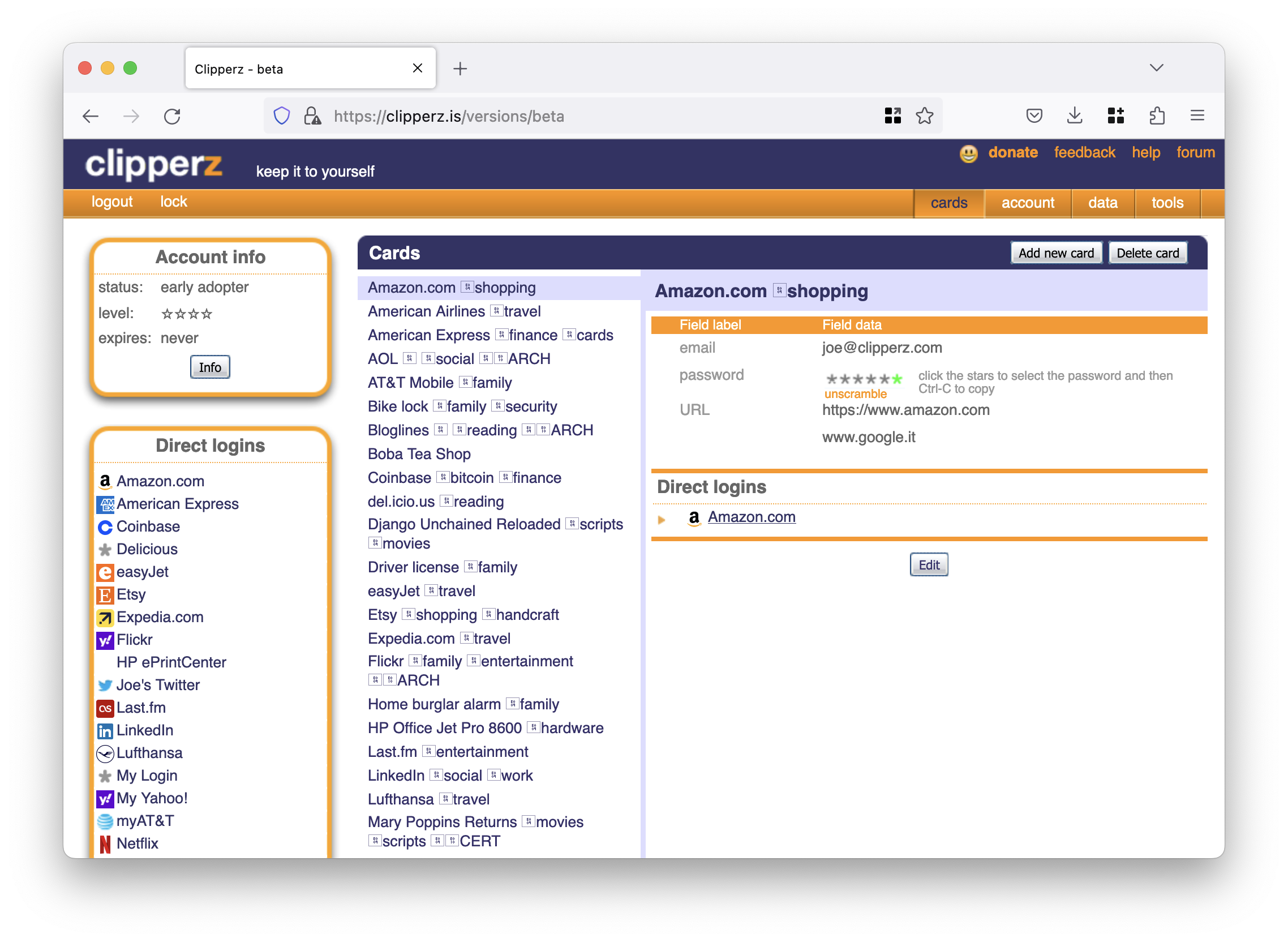

First public release! This was the version that put us on the web map; it was –and still is– just a tiny mark on that map, but quite a durable one. 😉
~2010 /gamma
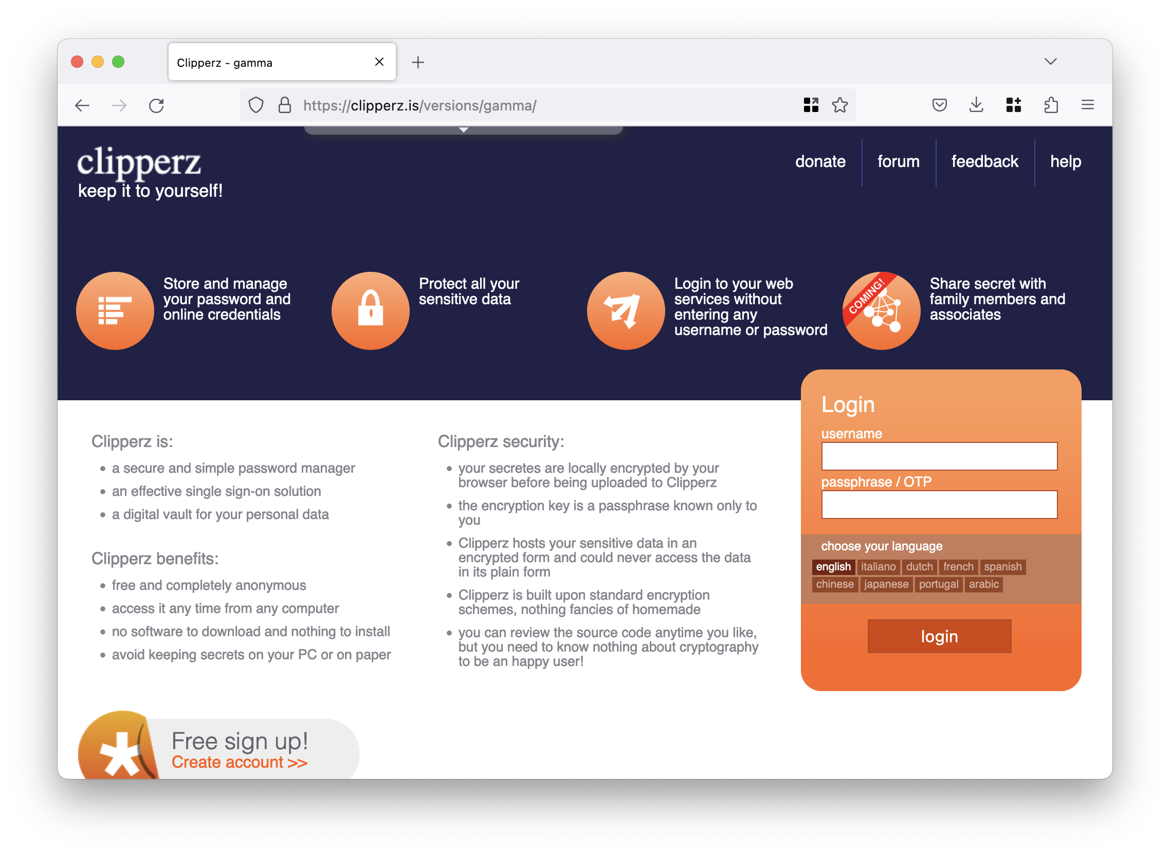
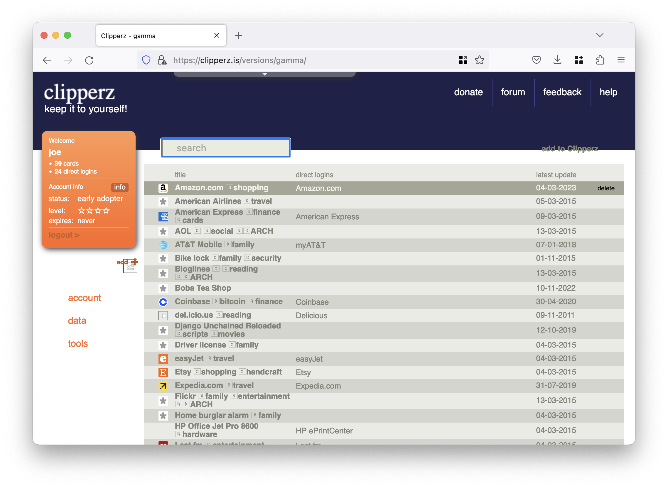
This was a full review of the UI design, done with the help of a really talented designer: Taddeo Zacchini.
Unfortunately, by the time we were getting ready to release it, the tech world around us had changed profoundly, and touch devices were getting so common and performant that we realised we should have made our application work smoothly also on these new devices.
At that point in time, releasing an application whose UI was all based on mouse hover effects no longer made much sense.
~2015 /gamma
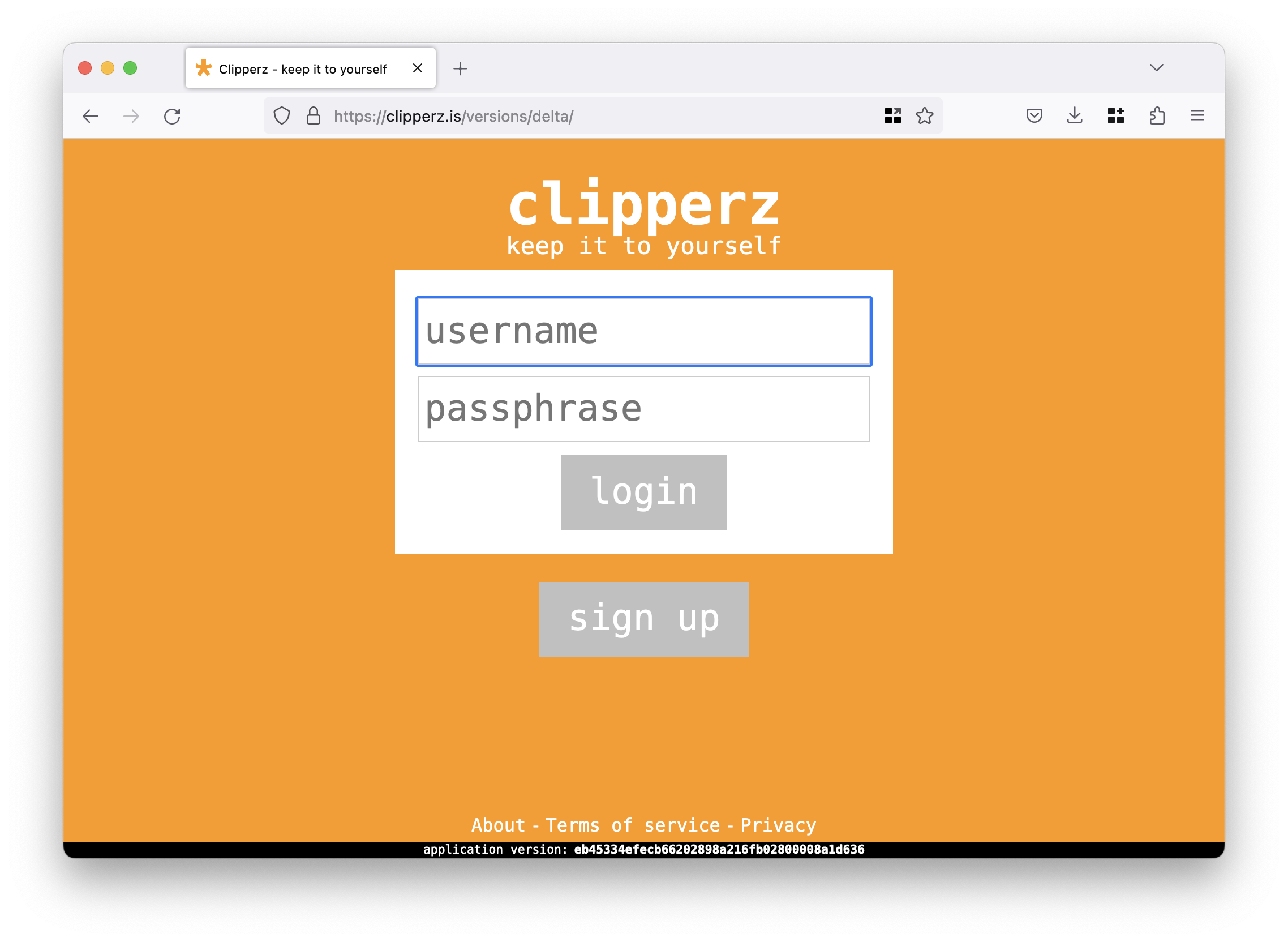
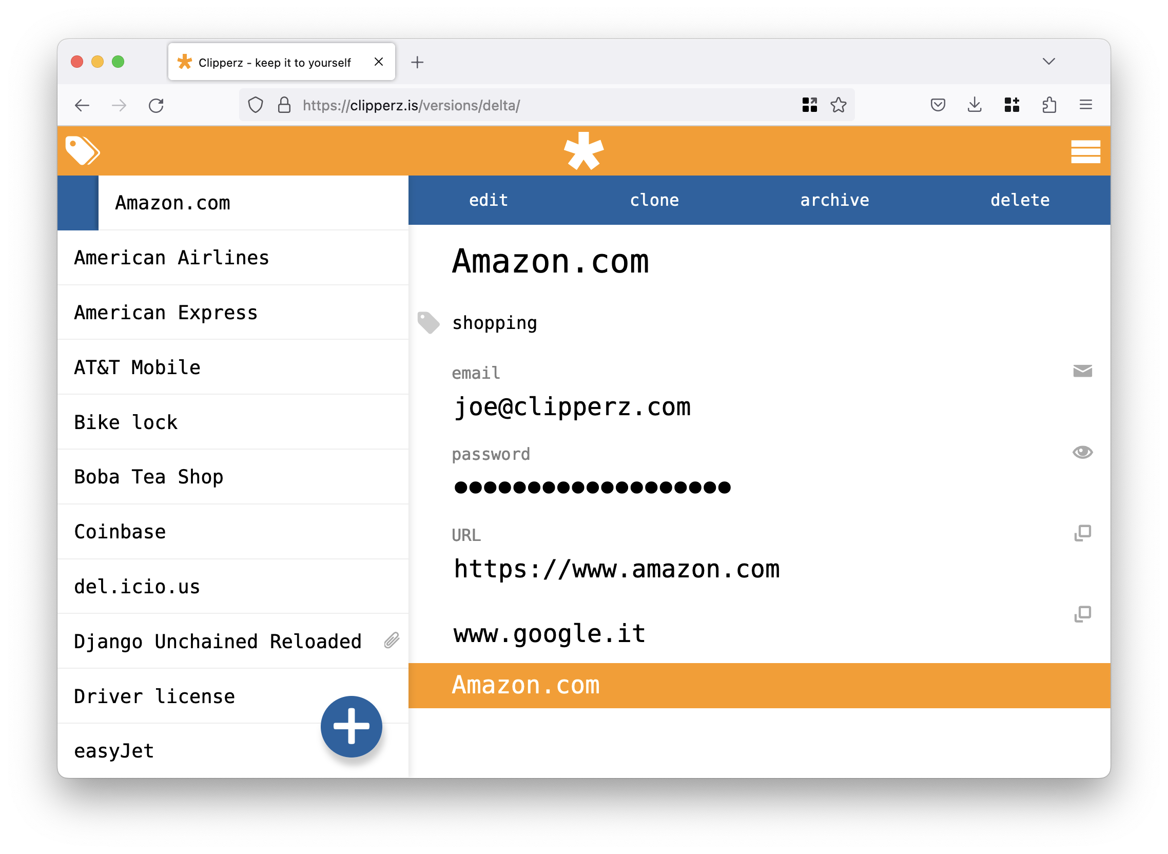
With the advent of React we found the technical foundation we were looking for to help managing the rich UI interactions required by Clipperz.
This new version was designed from the very begininng to be touch friendly, and responsive; these are now common concepts, we fully adopted 10 years ago.
The UI of this version was designed by another awesome designer with whom we had the luck to cross roads: Roberto Pasini.
~202? /…
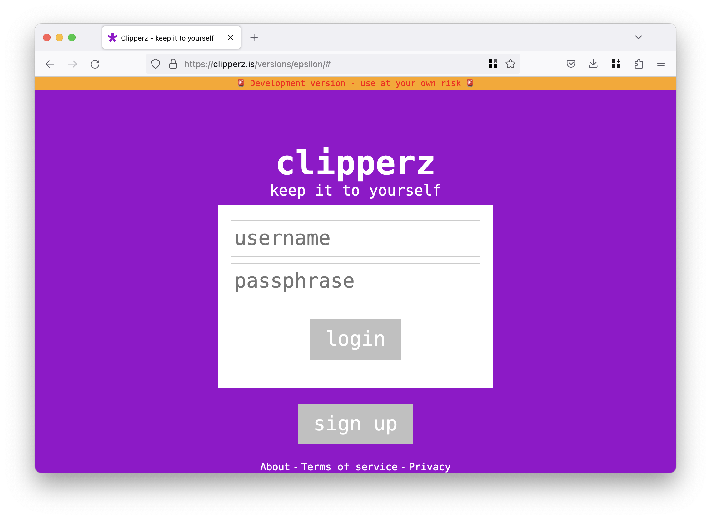
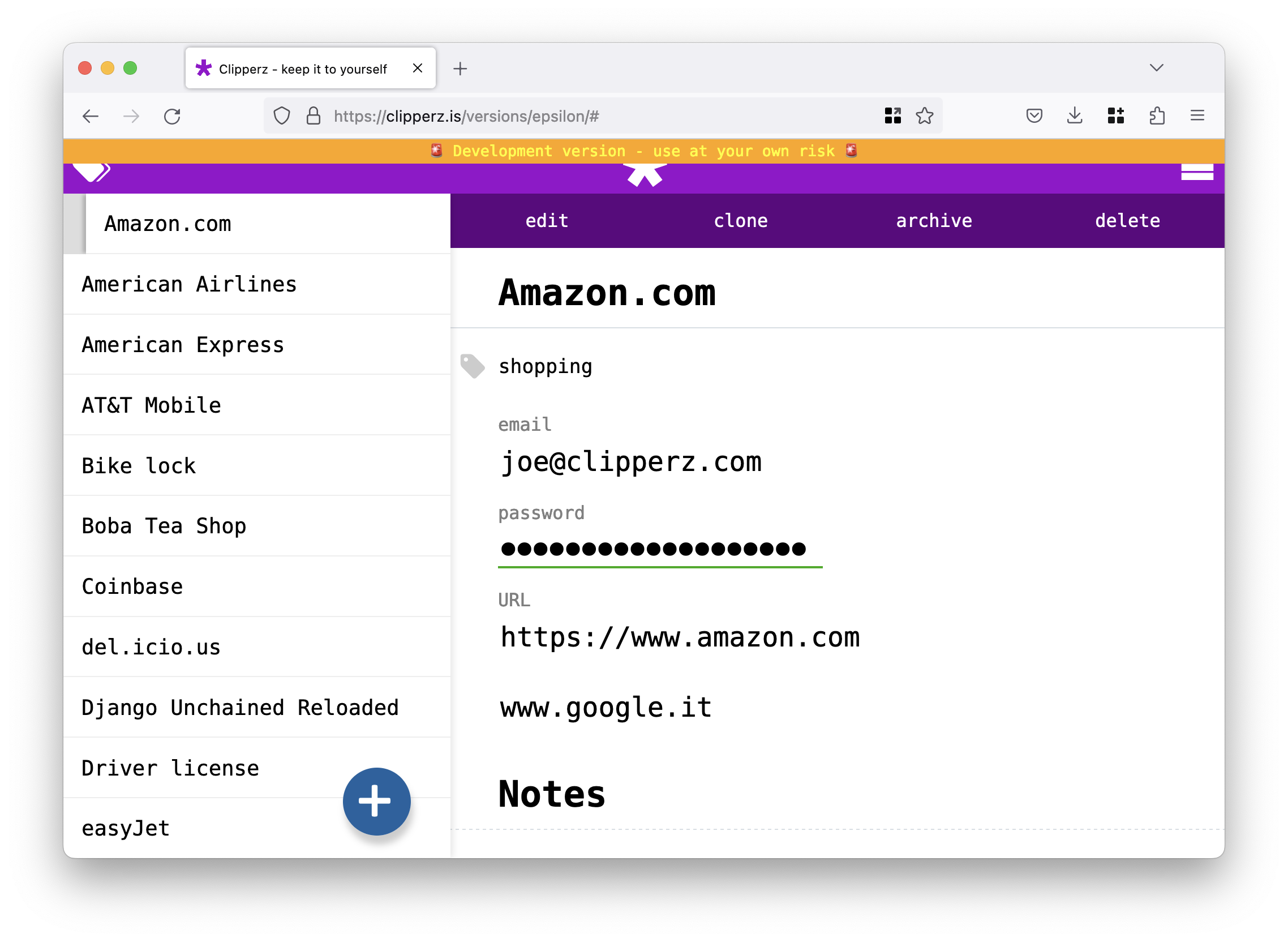
We are currently working on the next version of the application; this time we are going to keep the same UI of /delta (changing just the color palette to be able to tell the two versions apart), but completely replacing the tech stack.
We have now adopted PureScript for the frontend, and Scala 3 with ZIO 2 for the backend; this choice proved pretty challenging, but we are confident it will provide a much more robust foundation to keep builing on.
The new stack deployed a few days ago is going to allow to incrementally release new revisions of the new application version as soon as they’ll be ready. And we may be start leveraging some of the new fundations pretty soon, to power some new widgets we are getting ready for this site.
Could you guess how the new version is going to be called? 😜
All still working!
The most interesting part is that all these versions are still fully functional, with just some graphical resources missing.
You can try them out using your own credentials, but if you really feel nostalgic and want to try out the applications, we suggest to create a new user, just for fun.
BEWARE
if you have attachments in your account, you most probably will lose their content if you modify your data using an older version of the application.
If you are curious to try them out, these are the links to the different versions:
As always, if you enjoy our project, any support is welcome.
 Mastodon
 GitHub
 Twitter
 Google
forum