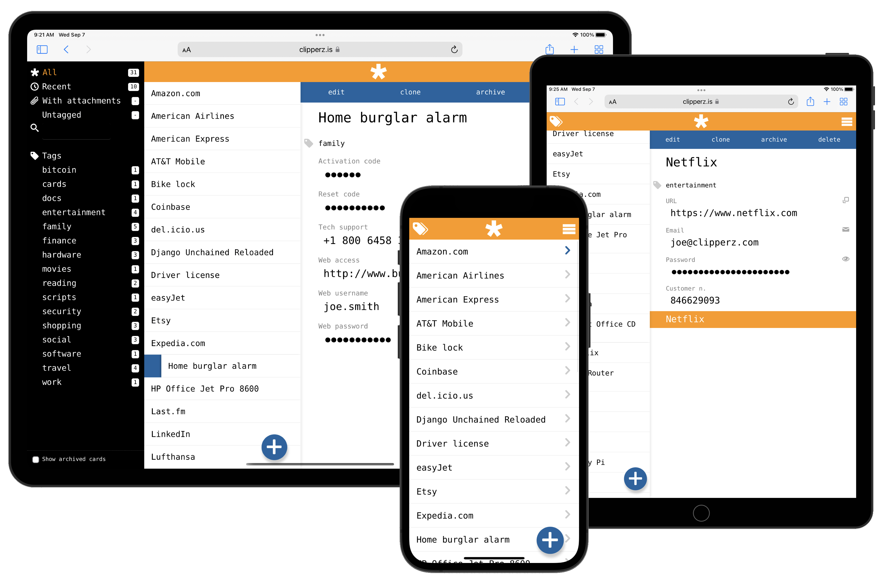
A brand new Clipperz!
July 06, 2015Clipperz was launched on April 2007 and since then not much changed in the design of its user interface. We’ve been continuosly improving the underlying crypto and the application logic to make Clipperz faster and more reliable. But we never touched that 2007 look.
Well, today we are happy and proud to announce a brand new design along with several new features you’ve been waiting for so long.

The most notable improvement is that now you should be able to use Clipperz on most smartphones and tablets. Its adaptive design change the layout from 3 panes to 1, depending on the screen size.
There are literally tens of small and not so small new features. Those with lots of cards in their accounts, will particularly appreciate the ability to quickly retrieve a card using the new search form. They will also like the new tagging system for easy card browsing.
What is missing? We regret to have temporarily abandoned the multilingual interface. As of today Clipperz is available only in English. However we are planning to start adding back translations for many other languages as soon as we complete the introduction of other exciting features.
And in case you were wondering, yes, Clipperz is still completely free.
That’s all for the moment. Please follow us on Twitter for more updates.
 Mastodon
 GitHub
 Twitter
 Google
forum